Fifty percent of daily business should consist of conveying the results of the other fifty percent. Already Henry Ford was aware of the importance of advertising. For every dollar you want to put into your business, you should prepare one dollar to tell the other people that you have invested one dollar. He was even not discouraged by the fact that at least half of the advertising was wasted money, because you can not know which half. If you eventually decide to communicate, then you need a story, then the story needs a Gestalt in order to find more easily the storyline and to be better understood.
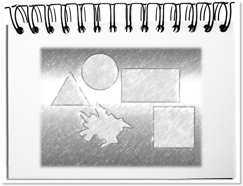
There are endless shapes in the design. Geometric shapes can usually be further dynamized by turning and distorting. As food for thought, we begin with the following simple versions.
- Triangle
The three corners make the triangle a versatile form. It is trend-setting, demanding attention, bundling, dispersing, expanding and much more. If you let your eyes wander, then you will find roofs, street signs, pencil tips but also river deltas and mountains. Everything can be reduced to triangles. If you look for your thread, then the story can begin at the foot of the mountain, develop from camp to camp, until the summit is stormed – but where the story does not end, since you still have to go down the hill.
The triangle offers many such opportunities to spin the thread in such a way that the corresponding emotions are created and well anchored and remembered by the target group. - Rectangle
The flat quadrangle provides an attachment point for all cultures, whether explored from left or right. It occupies an area, creates a base, encloses, excludes, creates order, has length and width, provides stability and much more. Many man-made things are rectangular, such as football fields, boxes, screens, picture frames, book pages and the plan of an apartment. A good story offers the target group a defined space with a comprehensible distribution. So you enter a story through the front door and find the hallway with its adjoining rooms. The path leads to the left through every room in which one topic is positioned, in order to leave the apartment at the end through the front door.
The rectangle should consist of 5plusminus2 simple chambers, which are filled with content and ensure that the target group will afterwards remember the right things with a high probability. - Circle
The simplest and most effective shape has no beginning and no end, no up and down, no front and no back, no superior and inferior. The circle is perfect, complete, protective, balanced, and timeless. One of the most important inventions was certainly the wheel that allows our vehicles to roll smoothly, providing watches a daily repetitive path, offers plates and cups ergonomics, providing herds, packs and groups the safest, because shortest, outer surface, and gave communities, like the Round Table of King Arthur, a hierarchy-free space. With a circle you have a harmonious shape that everyone imagines to be a perfect round. Politics have little space. Beginning and end create less discussion material, because you can get in anywhere and get out at any time.
The circle creates a space that facilitates the understanding and approval of the target group. - Square
The equal sides, four equal angles, equal diagonals and symmetry are making the square a special case of the rectangle (see above). No matter on which side it stands, it always appears the same. Additionally it has much of a circle due to its symmetry. It conveys stability, peace and security. Squares are rarely found in nature. Even everyday objects are less often square than one would think – only for example grids, tables, chairs, pictures, signs, cubes, post-its and chess boards. The themes of an action can be cleverly distributed on a checkered surface, expanded as desired, told from different perspectives with surprising features and quit at various points.
The square pattern can be easily remembered, reproduced, and correspondingly extended with ones own ideas. - Organic shapes
Nature creates shapes that can not be easily described. These abstract shapes are difficult to convey. For this reason, everyone makes up its own shape. Organic shapes are of natural origin, messy, difficult to control, adaptable and self-organizing. They are associated with fluids, vast amounts of constituents and masses of living things. They enclose with a huge outer surface and relatively small inner spaces. If it’s all about content, then this figure disturbs, because everyone imagines its own structure and is distracted by it.
Organic shapes are less suitable for conveying facts. They are ideal if you want to evoke impressions, feelings, approval and commitment, because everyone appropriates the shape, which fosters an affirmative consent.
Bottom line: The design of messages begins in the mind of the author and should take into account the targeted audience. In the interest of quick content creation and to facilitate understanding, geometrical shapes are available. The triangle, the rectangle, the circle, the square, but also the organic form is simple tools to guide yourself and the target audience through the messages. The meaning of each Gestalt underlines or hinders the message. So it makes sense to find the shape of the story in advance, as storytelling lives from the Gestalt.


