More and more figures are nowadays created and used as the basis for decisions. This leads to the fact that one does not see the forest for the trees. Charts provide a way out. Unfortunately the users do not always consider the influence of the style of the presentation. This is amazing, since the acceptance of a message is reinforced by showing figures smartly.
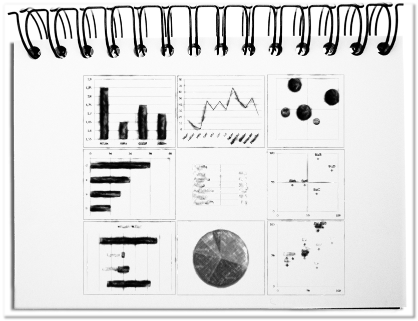
Pure numbers do not always clearly convey the desired impression. Luckily most computers have nowadays MS-EXCEL with various business diagrams, like column, line, circle and bar charts etc. Graphical presentations are beneficial. Those charts add to the actual numerical value a graphical aspect: larger or smaller, rising or falling, more or less similar etc. This strengthens the desired statement. The following aspects should be considered.
- Size
If orders of magnitude, like quantity, length, performance etc. are presented and compared, the bar charts or bar graphs are recommended. Thus, the different values can be prepared with horizontal bars or vertical columns side by side. The choice of the range strengthens thereby the message. Ranking becomes visible through additional sorting. The number of values that might be presented should be adapted to the presentation: for projections 7plusminus2, for A4 formats not more than 40 per page. - Progressions
Values that change over time are represented with the line diagram. Rising costs, employee fluctuation or changes of temperature can also be represented over very long periods. The line conveys intuitively the course of time from left to right. The number of visualized values is defined by the question, whether single values or general progressions are important. - Portions of a whole
If you want to show the portions of a whole, the circle or pie chart is perfect. The total circle represents thereby the 100%. If you want to compare the portions of different wholeness’s, you can use stacked bar charts. Usually the described elements should not exceed - Correlations
Scatter diagrams help showing patterns, in order to be able to recognize dependencies of values. Thus, the BCG matrix shows, based on a joint look at market growth versus market share, in which products you should invest or not. Additionally, scatter diagrams can be used, in order to identify unusual pairs of value that arise outside of the value cloud.
Bottom line: For various purposes specific representation types are best. Size comparisons are represented by column and bar charts. Courses of time are shown with line diagrams. Parts of a whole are prepared with circle or pie charts. Correlations become visible with scatter diagrams.

